Dear Moderator
Hello,
I hope you enjoy having a look at my A2 blog which I have created this year.
My Research and Planning starts in September and my Evaluation begins in March. You can find my final film poster, magazine and trailer at the top of my blog.
Thank you for all the feedback you have given throughout the year, it is appreciated and has helped me a lot.
Paige Lowe
:)
Thursday, 13 September 2012
Research and Planning: Photoshop Challenge
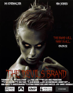
Today we were set the photoshop challenge task which was the see what we could remember about photoshop since we've not used it since before the summer holidays. We were told to take an image and make a film poster which is the same genre of the film trailer we plan to make for coursework this year; in my case the genre is horror.
I have looked at the typical codes and conventions of film posters and have tried to apply most of them to my photoshop challenge film poster. The codes and conventions are:
- A tagline for the film.
- A date for the release of the film or 'Coming Soon'.
- The films title.
- An image of something that relates to what the film is about and what it includes.
- Logos for who made the film etc.
- Usually includes actors names in a larger font somewhere on the poster, usually when they are popular actors as this helps to promote the film.
- Some posters include a certificate but not all.
- The film credits.
- The colour and lighting should hint at the genre of the film
As this was a quick challenge to just show what we remember I haven't used as many tools as I did in AS media. I got the image of the woman off the internet and opened the image up in photoshop then I decided to highlight the most creepy parts of the photo. I used the brush tool to draw red eyes and to paint red in her hair and around her fingertips, I also branded a faint 'mark' on her left shoulder. For these to look effective I had to change the brush size and brush opacity so it highlights some parts more than others e.g. I made the red blood near her fingers a brighter red than the mark on her back. I then used the blur tool for the black around her eyes to increase the scary look of the woman, I wanted it to look as if the black was spreading; like the evil is slowly taking over. I downloaded two fonts - the first was 'October Crow' which was a horror font which helps to portray the genre and 'Steel Tongs' to write the film credits which gives it a professional look.
Subscribe to:
Post Comments (Atom)

No comments:
Post a Comment